-
-
-
-
-
-
-
-
-
CFUW-Ottawa New Logo and Tagline
-
-
-
-
-
-
-
-
-
-
-
-
-
-
-
-
-
-

|
|
CFUW-OTTAWA – A NEW LOGO AND TAGLINE
CFUW at the national level has launched a rebranding of CFUW at both the national and local level.
The reason for this is that a brand is not just a logo.
- A great brand is created by aligning what you promise (your core messages, logo, visual identity, tagline, language)- and what you deliver (your clubs, community, activities, and advocacy work).
- The organization members are the brand. The activities, the energy, the way you interact with the world on a daily basis, is your living brand expression.
Logo for CFUW-Ottawa:
.png)
This logo is built from:
OPENING BOOK
- A foundation in learning and education
- Open and expanding
UNFOLDING PAGES
- A long history with many achievements
- Diversity of members
- A mosaic/lotus flower
FLAME
- Lamp of learning
- Legacy brand
- Lighting the way upward and forward
Tagline for CFUW-Ottawa:
As part of the rebranding a new tagline has also been developed:
![]()
REALIZING POTENTIAL
Realizing is both to understand and make real. A state of mind – to become fully aware – a process which speaks to the foundations of lifelong learning in your organization.
Potential is the outcome of your work. It’s the ‘vision’ that becomes a reality – seeing potential and bringing it to life. As an organization and member community, you see a potential goal, come together to find a solution, and bring it to life for the betterment of all.
FOR ALL WOMEN
This is a statement with powerful duality that defines both your organizations members and purpose. Your organization is “for all women” to join and participate.
The advocacy work you do is “for all women” – with your core focus being women’s empowerment, education, representation, equality, and human rights.
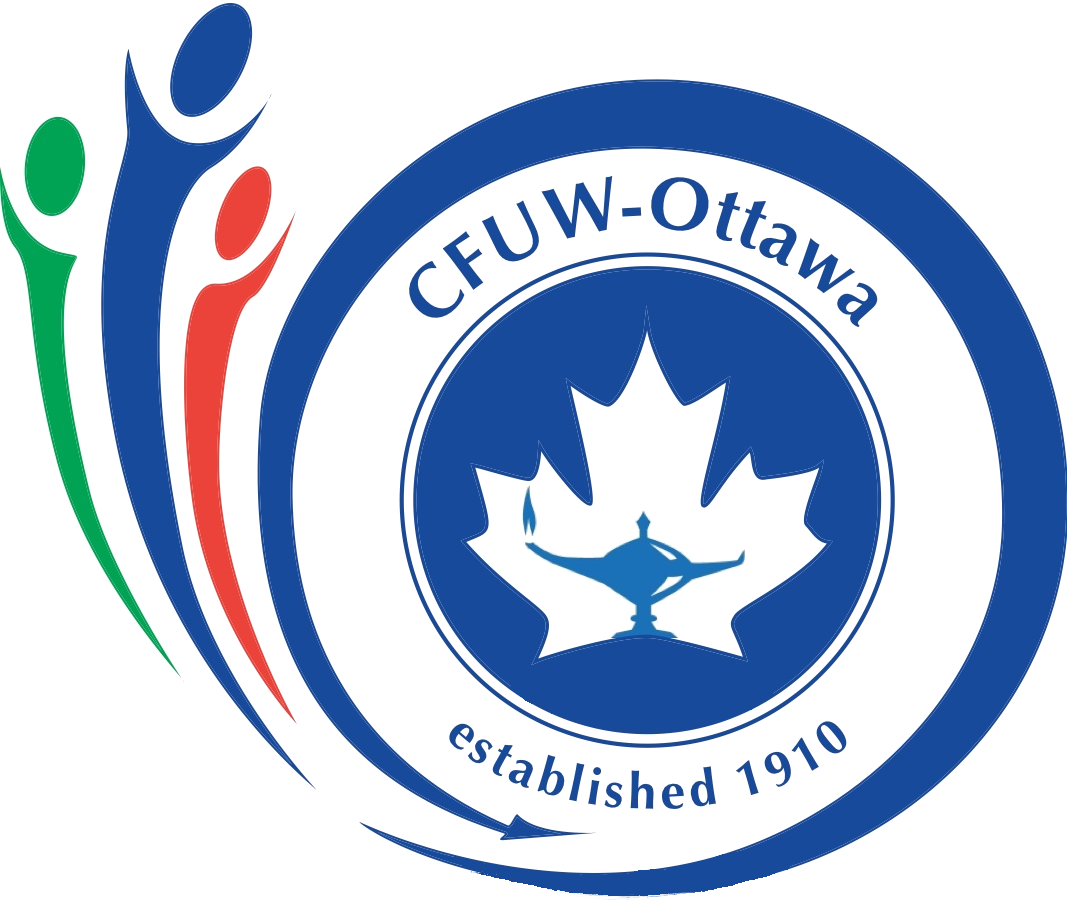
RETIRED CFUW-Ottawa Logo
The Club is now retiring our previous logo. The CFUW-Ottawa Logo was created to promote our identity as the unique and terrific club we are.
The three figures on the left of the logo represent Education, Human Rights (rights of women and girls) and Fellow-ship... or Socialize, Educate and Advocate. All three characters all come together in Ottawa with the CFUW: hence the arrow.
Green can be associated with life and growth. You may think of energy and strength with the colour red. The colour blue is often related with freedom, inspiration, sensitivity, wisdom and confidence.
Many thanks go to Elizabeth (Lizz) Wilfert for the design and Carol Hinde for putting the logo into digital form.
![]()
![]()
![]()
})();
}
catch(err)
{}